Introduction
RocketUI is a free, open source framework that provides ready-to-use frontend components that you can easily combine to build responsive web interfaces.
Installation
Looking to quickly add RocketUI to your project? Copy the link given below and paste it in the <head> tag of your html, above all other style sheets.
RocketUI uses material icons. Copy the given link and paste it in the <head> tag before the link mentioned above.
Typography
Change the size, weight and other font properties of the text
This library uses Roboto font-family. Different styles can be applied to the text using classes like heading, h1/h2/h3/h4/h5, txt, txt-primary/txt-gray, txt-center/txt-left/txt-right etc.
Headings
Heading 1
Heading 2
Heading 3
Heading 4
Heading 5
Text based on size
Normal text
Gray text
Large text
Medium text
Small text
Text based on weight
Bold text
Light text
Text based on alignment
Text in left
Text in center
Text in right
Spacing
To apply margin and padding to elements
Different margins and paddings can be applied to the elements using class prefixes like m-, mx-, my-, m-auto, mx-auto, p-, py- etc.
Margin and padding
Margin-0
MarginX-1
MarginY-2
Padding-3
PaddingY-4
PaddingX-5
Margin-auto
Grids
Create visual consistency between layouts while allowing flexibility across a wide variety of designs
This library has 2-column and 3-column grid layout. It is built with grid and is fully responsive. Number of columns covered for different screen sizes can also be modified using class prefixes like col-lg-, col-md- and col-sm-.
3-Column grid
2-Column grid
Mix and Match
Alerts
Provide contextual feedback messages for typical user actions with the handful of available and flexible alert messages
Alerts are available for any length of text along with five color variants. For proper styling, alert class can be used with other contextual classes(eg: alert-primary).
Primary Alerts
Info Alerts
Success Alerts
Warning Alerts
Danger Alerts
Avatars
Provide a visual representation of a user or entity
An avatar can be circular or square and small, medium or large, depending on the usage. The default type is a rounded avatar and requires avatar as the base class. Avatars can also be grouped or stacked to represent a group of people. It can be done by wrapping all avatars inside avatar-group and avatar-stack classes.
Rounded Avatars
Square Avatars
Avatars with icon
Avatars group
Avatars stack
Badges
Visual indicator for numeric values such as tallies and scores
Badges can be used to draw attention and display statuses or counts. All types of badges must have badge class. Based on the requirement, badge-avatar, badge-icon-sm, badge-icon-md, badge-icon-xl etc. can be used.
Badges on avatars
Badges on icons
Buttons
Clickable items to perform actions
Buttons can be of various types - basic button, filled/outline buttons, disabled buttons,button with icons, floating action buttons, link buttons.
Basic buttons
Primary buttons
Success buttons
Danger buttons
Info buttons
Buttons with icon
Buttons of different sizes
Cards
Surface that displays content and action on a single topic
All cards will have a common card class. Type of cards included in this library are - card-basic, card-hz, card-w-badge, card-overlay and card-dismiss.
Basic card
Card with footer
Horizontal card
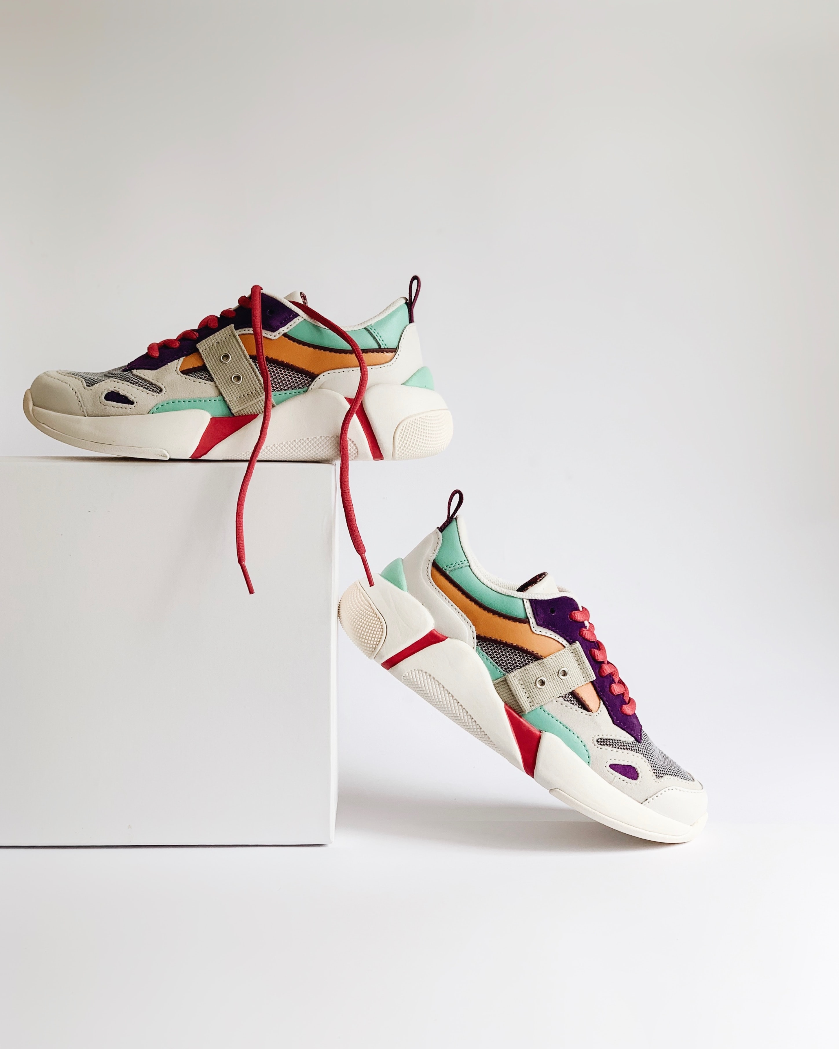
Card with image

Card with overlay
Card with badge

Card with dismiss button

Dialog
Displays content that requires user interaction, in a layer above the page
dialog-window class can be used as a wrapper to display a dialog window above rest of the content.
Dialog with header and footer
Images
To display images on website
Types of images included: img-responsive, img-square and img-rounded.
Responsive image

Rounded image

Square image

Inputs
To let users enter and edit text
Use input-label and input-outline classes for label and input tag respectively.
Wrap both of them inside input-group class. Similary
you can use textarea-group and textarea-outline for text-area.
To display error or
success messages for inputs use msg-success and msg-error classes.
For radio buttons and checkboxes with label, wrap radio-input-group and checkbox-input-group inside input-radio and input-checkbox respectively.
Basic input field and textarea
Input field and textarea with messsages
Radio button and checkbox
Range Slider
List
Lists are continuous, vertical indexes of text or images
Lists can be bulleted, non-bulleted, inline, stacked etc. By default the list are non-bulleted.
One can use list-group, list-group-bullteted, list-group-inline and list-group-stacked classes as per the requirement.
List items can also have images, avatars and two-line texts. list-item, list-item,
list-w-icon and list-w-avatar classes can be used for list items.
Basic list
- Item 1
- sub item 1
- super sub item 1
- super sub item 2
- super sub item 3
- sub item 2
- sub item 3
- sub item 1
- Item 2
- Item 3
- Item 4
Bulleted list
- Item 1
- sub item 1
- super sub item 1
- super sub item 2
- super sub item 3
- sub item 2
- sub item 3
- sub item 1
- Item 2
- Item 3
- Item 4
Inline list
- Item 1
- Item 2
- Item 3
- Item 4
Basic stacked list
- Item 1
- Item 2
- Item 3
- Item 4
Stacked list with icon
Stacked list with avatars
-
Item 1

-
Item 2

-
Item 3

-
Item 4

Stacked list with two lines
-
Line 1
Sub-line 1
-
Line 2
Sub-line 2
-
Line 3
Sub-line 3
Stacked list with two lines and icons
Stacked list with two lines and icons
-

Line 1
Sub-line 1
-

Line 2
Sub-line 2
-

Line 3
Sub-line 3
Navigation
List of navigation links that users can find in the Header of every page
Navigation bar includes brand name(or logo), list of navigations, actions icons and buttons.
Responsive Navbar
Ratings
Provide insights regarding others' opinions and experiences, and can allow the user to submit a rating of their own
rating and rating-read-only classes can be used based on the requirement.
Basic rating
Read-only rating
Snackbar
Serves as a feedback and confirmation mechanism after the user takes an action
All snackbars will have snackbar class. Snackbars can be positioned using snackbar-top-right, snackbar-top-left, snackbar-top-center, snackbar-bottom-right, snackbar-bottom-left and snackbar-bottom-center classes.